blog
Scholastic 144
For my scholastic 144 piece I am going with the theme of mother and child, and the shaming of a woman breastfeeding in public.
This is to emphasize the comments and harassment a breastfeeding mother can hear and deal with on an every day basis.
I want to convey the darkness of these comments, and also express the irony of our society when they make such comments by adding the pictures of real ads that show off a woman's body in a sexual manner and that being socially acceptable.
For my mediums I am going to use an oval piece of wood and collage over it with black and white images and words. To create a cleaner look I am going to use gold to create a thin border between the collage and wood. To help emphasize the importance and purity of the mother's love for her child I'm going to paint a wash of black watercolor over the collage and make it darker towards the middle. Over top the collage I'll paste a marker drawing of a mother holding her child and once again use gold to create a halo over the mothers head.
Research:


Sketches and Ideas:


In progress
Final Piece:

Problem Solving - When I was working on the gold details, I could't find any paint that was the color of gold nor shiny enough for the gold look I wanted. To make a more realistic gold color I wanted to use this gold powder, but it was hard to control to make fine lines and was very sheer. To make it paintable and more opaque I mixed the gold powder with matte medium, making it very easy to control and a smooth gold paste.
Communicating through my work - I wanted to express the hardships of a mother who decides to breastfeed their child by having the background be harsh words such as "gross" and "why don't you wait until you go home?". I made the mother such a warm color to combat the darkness around her, which expresses all the negative around her, but shows that her love will shield her child.
Communicating through my work - I wanted to express the hardships of a mother who decides to breastfeed their child by having the background be harsh words such as "gross" and "why don't you wait until you go home?". I made the mother such a warm color to combat the darkness around her, which expresses all the negative around her, but shows that her love will shield her child.
Mixed media:
Although my finished mixed media piece seems sort of out there, there is actually a lot of meaning behind all the different elements. I got lucky because at this moment my favorite colors are actually orange and black, making this more personal to me. Since this piece is suppose to represent our identity I would like to break my work down into how it represents me. I'm going to start with the more subtle aspects of the piece then work my way to what jumps out the most. The background is the earth exploding. I went with this because of the fact that the world is a messed up crazy place right now. With all the violence, crimes, war, natural disasters, climate change and an never ending list of tragedies I see the world just falling apart. I also added vines and leaves to represent my love of flowers and nature, and I left them white mostly to keep the piece from being to busy and to make it more clean; but if you want to make this more edgy then you could say that it represents nature fading away into nothing. To also emphasize my love of nature I included flowers, which I used to help frame the picture and the bunny. The part that sticks out the most would be the bunny. The reason I made it black was because although I am cute like a bunny, I also deal with depression and anxiety, and the stars help tie in the earth floating in the background in space. I chose a bunny mostly because they are seen as creatures that run away, are vulnerable, scared, and easily captured and hurt. It's because of these traits that I decided to make the bunny curl up, further expressing these feelings. I then placed five flowers around the rabbit to represent my family and I, to represent my parents and my brother and sister being there to protect me. I think this piece represents me well by expressing inner feelings and ideas that I don't quickly tend to tell others about and showing both my cute and dark sides.

Artistic behaviors:
Planning- I planned my artwork by making sketches and thinking about how all these different elements would work together to make a cohesive piece. When coming up with my design I first thought of doing a bunny and the earth. I then thought about making the flowers, so I planned to make the bunny curled up so you could see the earth behind it and to have the flowers and leaves create more of a border to draw the eye to the earth and bunny and naturally frame and ground everything.
Problem Solving- I used problem solving when it came to making my bunny. I wanted to be able to see the earth from behind my bunny, so I had to keep my bunny smaller then the earth. I kinda guessed how big the bunny should be and sketched out a rough circle to create a maximum size border that I needed to keep my bunny within. When I finished drawing and cutting out my bunny I was kinda disappointed by the fact it was too big and that you couldn't see the earth. At this point I knew my only option was to remake it so I did. I drew the bunny to be smaller so I could see the earth and was much happier with the results.
Metamorphosis
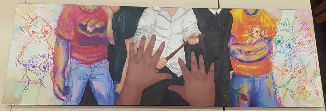
For my metamorphosis piece, I decided to go down a kinda dark path. Although I have a healthy home life with loving parents, and hopefully they won't get concerned and freak out when they see the finished work, I decided to go with the theme of child abuse. It's one of those topics that people don't talk about, understandably because its difficult to do so, but when they do they just lable the abuser as a monster and don't think beyond that. I want to show that people, for the most part, are not born evil and abusive. I'm doing so by showing the downfall of a man who's wife dies and turns to drinking, and in fits of drunken sorrow and anger over the loss of his wife he resolves to taking these emotions out onto his child. To represent the metamorphosis I wanted to show the memories of the child of how their dad used to be. I wanted to show the stages of the child's and dad's life, starting with the dad helping the child walk up to today showing an intimidating stance suggesting he's about to beat the child. If you look carefully, you'll see the abusive stance in the middle, then going down from the left side you'll see the man with a bottle, then a catcher's mitt, then finally him helping the child take their first steps. On the right side of the center figure is the man in all black with flowers to represent him at his wife's funeral, then him holding a puppy, and at the end is the kid's drawing of all three of them together. I wanted the memories towards the ends to turn into the kid's drawing to show that the kid is forgetting those memories, and now has to rely on the drawings they once made to remember the good times. For my medium I want to use prismacolor color pencils, but at this moment in time I'm not sure if I want to draw in just paper or if I wan't to use wood or a mix of both. Since I want to make this drawing very large since it is a very emotional and shocking topic to choose, I may even use acrylic paint depending on how large I decide to make it.
My final piece ended up being made out of sharpie, watercolor, acrylic, and prismacolor color pencils on canvas.
My final piece ended up being made out of sharpie, watercolor, acrylic, and prismacolor color pencils on canvas.
Inspiration and reference
Sketches
In Progress

Final Piece:
Artistic Behaviors:
Communicating through my work: By having the multiple memories that come out from the center figure I tell a story of a man who's wife dies, leaving him with their only child. The overbearing grief of the loss leaves the man unbearably depressed, causing him to drink. The combination of the man's feeling of anger and sadness, and the constant drinking leads him to lose all control and lash out on the child. I wanted to tell the viewers that not everyone who is abusive started out bad, that someone who was nothing but kind and loving can be so traumatized that they lose themselves, and that the trauma is what makes an abusive person.
Developing skills: Although I've played around with acrylic paint, I never actually made a large painting with it. There are defiantly some things I wish I had the time and skills to fix, like making the man with the baseball mitt's arm smaller, but for my first big piece I think it turned out pretty well. Spending so much time with the paint and being forced to work with it when it wasn't doing what I wanted it to really helped me figure things out and become more comfortable with the medium.
Social Commentary
For my social commentary I wanted to make a drawing that represents the idea that women who wear a hijab are not always oppressed nor wear them because they are forced to. Especially in America, Islamic and Muslim women who wear hijabs on their own terms are targeted by ignorant, inconsiderate, and racist people who tell them to take their hijabs off. Although some people think they are saying these things with what they believe are good intentions, letting these women know that "they are in America now so you don't have to wear that, you're free now" they are making them feel attacked and like they have no religious freedom. These women are free. If they want to wear a hijab, then they can. This piece is meant to represent the fact that women can make the choice to wear a hijab, and are happy to. The girl in more revealing clothing is there to represent that the woman with the hijab isn't alone and hangs out with other women that don't share the same beliefs. They have a close friendship and have similarities, but are different in their own beautiful ways. For this project I used Copic, Prismacolor, and Micron markers, white gel pen, and blue acrylic paint for the background. I made the illustration an a 10 x 9 sheet of watercolor paper.
Reference Pictures:
Sketches:


In Progress:

Unfortunately, in the mad rush of trying to complete this I forgot to take a more early on in progress picture and only had to add highlights by this point.
Final Piece:

Artistic Behaviors:
Original art - My drawing is original art due to the fact that it was done in my style of having cartoony figures with realistic and detailed shading.
Communication through my work - I communicated the idea that people who are Muslim or Islamic have more in common with people who have a different religion, or lack there of, and way of life by using a similar color scheme for both women. I purposely made the hijab and the women's hair pink and their clothing black to subtly say they are the same. I also wanted to keep them slightly different because everyone has their own personality so that's why I made the pink slightly different, and the one top have blue undertones and the other have purple. Their happiness and closeness is used to express that they are happy the way they are, and choose to be that way without judging others for being different.
Communication through my work - I communicated the idea that people who are Muslim or Islamic have more in common with people who have a different religion, or lack there of, and way of life by using a similar color scheme for both women. I purposely made the hijab and the women's hair pink and their clothing black to subtly say they are the same. I also wanted to keep them slightly different because everyone has their own personality so that's why I made the pink slightly different, and the one top have blue undertones and the other have purple. Their happiness and closeness is used to express that they are happy the way they are, and choose to be that way without judging others for being different.
